Contributor
- Joined
- Jun 25, 2019
- Messages
- 114
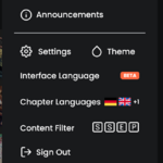
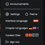
The top right menu on desktop, clicking the avatar, has a quick access to Content Filter settings. This is nice, but not quick enough for me. I want to see my Content Filter settings similarly to the Chapter Languages.
I have attached some windows paint mockups.
This could be designed many different ways, instead of coloring the box it could be just the letters, just the boxes, checkboxes as in the settings page... something better left to people other than me, bored frontend devs/designers.
(My intention has these boxes not interactible, just opening the menu below as it is. Tho this might be weird.)
Attachments
Upvote
3

