- Joined
- Jan 24, 2018
- Messages
- 3,230
As the title suggests, it's confusing to associate the search bar textbox as a "filter" along with the other search conditions. The title of something isn't normally regarded as a "filter" for a regular user. It's also doubly confusing because the search bar has its own "X" button to clear itself.
If you click reset filters, it should clear the other conditions, but not clear the search bar. The search bar can be cleared on its own quite easily given the dedicated "X" button for it, and people are used to handling search queries.
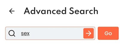
Speaking of the Advanced Search Page's textbox button behavior, when you're typing in the textbox, the textbox has an "->" when in focus that can be clicked to initiate the search. This is another case of unnecessary behavior because the "->" is acting like the "Search/Go" button that initiates the search even when it's likely nobody will use it.
IMO the search bar doesn't need the "->" state at all given the existence of the search button, and should instead behave more similarly to the top navbar's textbox or the /search page textbox where it's blank while active and then shows an "X" to clear itself once unfocused.
Attached is an example of how silly it feels to have two buttons that have the same purpose of initiating the search right next to each other.
If you click reset filters, it should clear the other conditions, but not clear the search bar. The search bar can be cleared on its own quite easily given the dedicated "X" button for it, and people are used to handling search queries.
Speaking of the Advanced Search Page's textbox button behavior, when you're typing in the textbox, the textbox has an "->" when in focus that can be clicked to initiate the search. This is another case of unnecessary behavior because the "->" is acting like the "Search/Go" button that initiates the search even when it's likely nobody will use it.
IMO the search bar doesn't need the "->" state at all given the existence of the search button, and should instead behave more similarly to the top navbar's textbox or the /search page textbox where it's blank while active and then shows an "X" to clear itself once unfocused.
Attached is an example of how silly it feels to have two buttons that have the same purpose of initiating the search right next to each other.
Attachments
Last edited:
Upvote
1