Dex-chan lover
- Joined
- Aug 9, 2018
- Messages
- 87
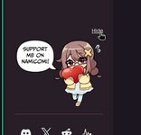
Regarding the NamiComi link at the bottom of the mainsite pages. Previously disabling the experimental setting to see affiliated animations disabled it all together, but now the still icon + name is there even with the setting disabled.
My tiny complaint is that the big blue icon and large text always loads first before the rest of the page and is a bit distracting. The other links to Twitter, Discord, etc are just black and white icons that are same size so they are not as distractive (I’m on dark mode on my phone if that matters).
I understand and appreciate that Mangadex is expanding into comics and is trying to promote it. It’s just that the link stands out a bit too much when the page is loading up. I would greatly appreciate if there’s an option to hide it or if it can be “standardized” like the rest of the links to Twitter etc.
Upvote
1

