You are using an out of date browser. It may not display this or other websites correctly.
You should upgrade or use an alternative browser.
You should upgrade or use an alternative browser.
Gantz - Vol. 1 Ch. 1 - Accident
- Thread starter MangaDex
- Start date
Dex-chan lover
- Joined
- Nov 18, 2018
- Messages
- 16,138
Nostalgic manga. 
Dex-chan lover
- Joined
- Jan 22, 2019
- Messages
- 317
Man, Gantz was such a great series, the way it felt like there was nothing like it before, felt so new and unique. Thanks to you i'm going to re-read it
Don't know why they're doing this. It's not like the previous translators were bad. Comparison shows that they actually used more natural English than these new guys.Why re-translate this? What is the point
Dex-chan lover
- Joined
- Apr 28, 2023
- Messages
- 749
W
Power Uploader
- Joined
- Jan 19, 2018
- Messages
- 249
I'd also like to add on to this and point out the sheer lack of quality cleaning this group has been doing.Don't know why they're doing this. It's not like the previous translators were bad. Comparison shows that they actually used more natural English than these new guys.
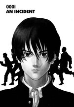
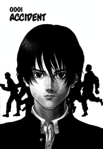
Just compare the title page for the first chapter:


Sure, there's slightly less cropping on the re-translated version and it's higher resolution, but the black levels are super crushed, and there's tons of dark grey details that have been leveled out. It's especially noticeable in Kurono's hair. There also appears to be some grey tones left over from the page edge on the left side.
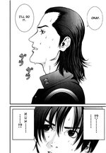
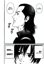
But it's not just images converted from color pages, either. Here's another example from the first chapter:


Not only are the dark grey details getting removed once again due to over-leveling (just look at all of the hair lines that are just getting lost in a black blob). It's also apparent that whatever de-screening technique they're using is creating some nasty looking checkerboard screentones (if you can call them that). The higher resolution scans really aren't doing the image quality any favors when this disgusting filter being placed over it.
I haven't read it to see how the translation itself compares, but if it really is true that it's not even as natural sounding as the old scanlation, then the only benefit of this new version appears to be the improved typesetting, which admittedly does genuinely look good.
If you ask me, this group should take a hard look at their cleaning process and try to improve upon it, as that's the biggest detriment to this version. Whatever they're doing is messing up the quality of the drawings quite a bit, and even removing large parts of the artwork. And what the hell is the point of even reading a manga if you can't appreciate the artwork?
Last edited:
Dex-chan lover
- Joined
- Aug 15, 2024
- Messages
- 678
i just watched the first several eps of the anime for the first time and jumped over here to see what was available. Great timing on a new TL!
Dex-chan lover
- Joined
- Feb 22, 2021
- Messages
- 774
This re-translation is so uncalled for. The original ones were best kept frozen in time, the charm of the scanlation era. Everything was so meaningful and on point, this new one just feels like somebody’s excuse to play with AI image tools and translations.
Similar threads
- 1
- Replies
- 2
- Views
- 1
- Replies
- 2
- Views
Users who are viewing this thread
Total: 2 (members: 0, guests: 2)