Please critique me daddy.

Group Leader
Joined
Jan 18, 2018
Messages
147
Hello there everyone.
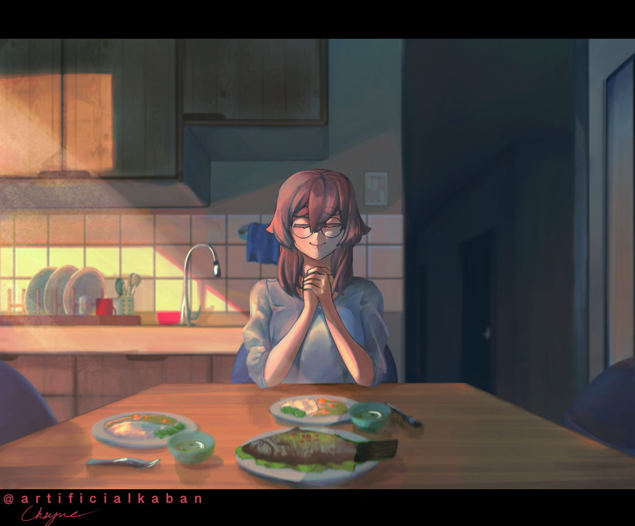
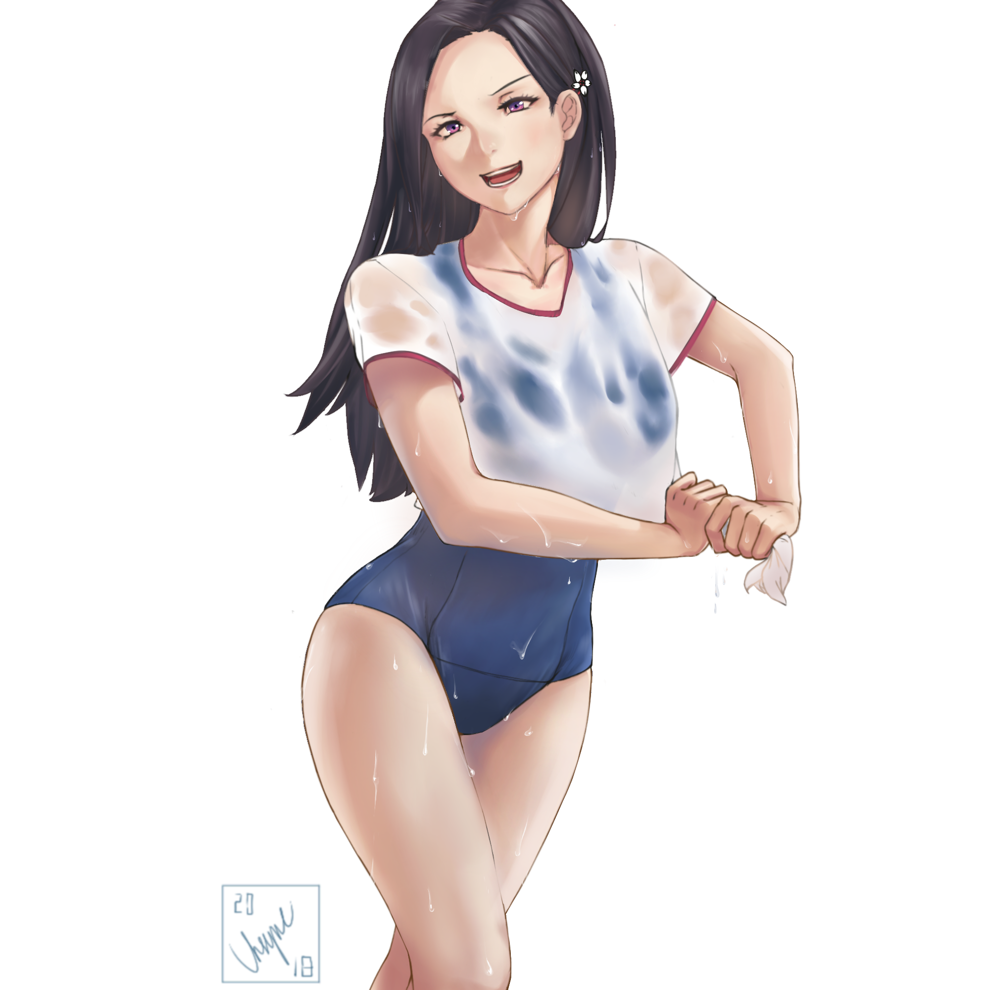
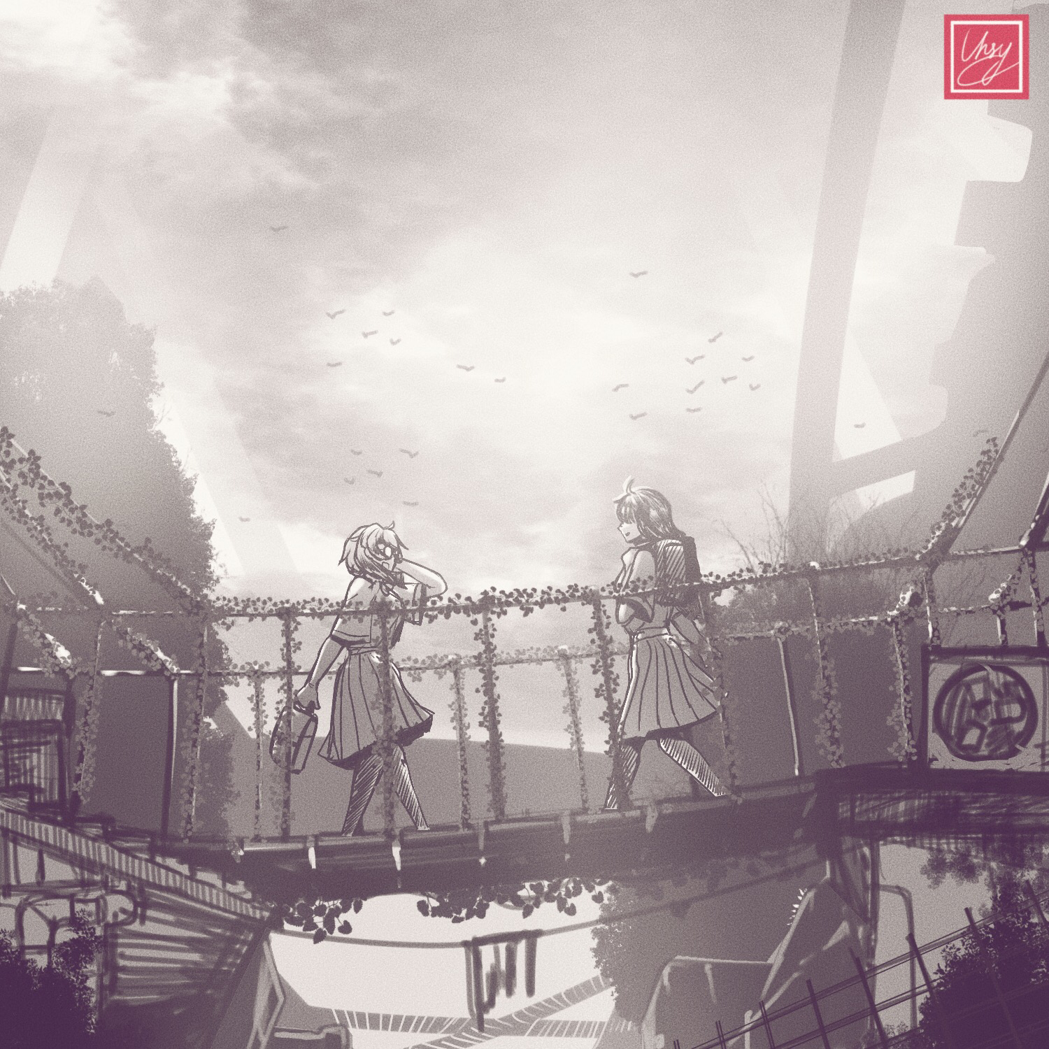
Please critique my drawing and help reignite my love for art. Don’t hold back. I do need a beating or two because I feel i’m reaching the stagnation point of my own creative thinking.

dNTqEFE.jpg

oKyiIHd.png

LKsd7R7.jpg

WmTgQeL.png

i2jeKAD.png

Here is a link to my imgur gallery if you need further examples.

https://imgur.com/gallery/uwDBFQ7

Alright. Here goes nothing.
 
Joined
May 31, 2018
Messages
84
First off, they're fine. Certainly good enough to be post on pixiv without embarassing yourself. Line art, cloth folds, light and shadow, coloring are all nice.

As for critiques, I'll try to point out what bits I could:
- you seems to have some trouble with "non-human" parts on girls. They often seems like they aren't really belong to the girls they're on. This is a bit tricky to find real life ref, but you could try to make a very rough sketches in many perspectives to see where those extra parts are suppose to be connecting to the human body.
- bane of every artists: hands and perspectives. They seems good enough until you give them a few more look over. You'll just have to look at real life photos and practice more.
- clothes on skins sometime looks like they're part of the skin and not objects on skin. This is also a common problem for many/most artists. You could try to give the clothes some thickness layer to contrast them with the skin, or in case of tight-fit clothes like swimsuits, have the clothes slightly dig into the skin at the edges. I can already see you did some of that in some pics, so do that more often.
 
Dex-chan lover
Joined
Sep 1, 2019
Messages
10,545
Generally good, great even, but if I were to have areas of improvement

-There are some sketches where the proportions look off. Hands in some look great and in others have features slightly eschewed or have some uncanny aspects to them. It's not atrocious, but it's noticeable when fingers are slightly too far to one side or another or if someone's head feels a bit too cartoon-y in an otherwise realistic image.
- Some clothes and parts of clothes feel like they don't wrap around, like sleeves. I'd suggest adding a bit more details to imply the curve of wrapping around
-Some of the clothes can seem a bit bulky at times

Note though that some of these vary between pieces and because I don't know the chronology of them, you may have solved some of these criticisms already.
 
Fed-Kun's army
Joined
Jan 20, 2018
Messages
1,692
Lacking moe
The composition on last one pretty good though. I would probably increase the contrast and use less gray so the girls can get more spotlight.
 
Dex-chan lover
Joined
Jul 12, 2018
Messages
1,130
Those are some nice drawings!
Do you have Twitter, Pixiv, or any other art sites you post at? Because I want to bookmark all of them!
 
Joined
Feb 4, 2019
Messages
7
Definitely can tell you've been practicing. Certainly looking like you can get even better; you have good potential. For the first example the perspective is generally well accomplished and you get a feeling right to left that flows with the lighting. The fore and background also are drawn into this. You could develop them more towards realism maybe with reference photos or perhaps otherwise make them more color dramatic to bring them into the figures more while giving tge characters context. The lighting on tge characters is accomplished enough but doesn't have any particularly remarkable impact from one to the next. This is something you could play with that might change up the color drama a little bit too. It's a warm picture and the figures are well accomplished in pose and expression to that effect. Their might be more chance of study within the figures by flipping it upside down and reversing it, more often &/or with your figures in general? Also there seems to be good things that are more apparent at different levels of zoom with regards to shape and form and figure highlights. From left to right hips, hand face on the 1st are well done and draw you in nicely. How the upper outfit relates or embellished the different poses is a point of contention seen in the shoulders here. The contraposto (forget spelling) is otherwise well done aside from the line of the shoulders being lost in the outfit a bit. Meanwhile the hips and bum are well accomplished and effective. You might have done yourself in with the hair there too (or the combination of hair and outfit) in shape and color. It could be a bit more engaging and dramatic as it is a good idea and stands in contrast to the length on the opposite side.
All in all i would say love what you draw, bit by bit, know that you're making something that others enjoy. ✌😍✌
 

Users who are viewing this thread

Top