Site Update - 14th of November 2023 (Advanced Search rework)

Head Contributor Wrangler
Staff
Super Moderator
Joined
Jan 18, 2018
Messages
1,946
Hello, people. We have a new site update.

Added:
  • On the advanced search page, we added an "I'm feeling lucky" button for all devices (previously it was PWA-only), which navigates you to a random title that satisfies your search filters.
Changed:
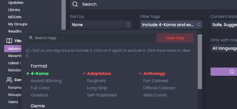
  • The advanced search page filters have been rebuilt from scratch. You should now have a better experience applying tag filters, and it should look more organized. I hope you like it.
  • For theme builders, you no longer have to specify the various translucency levels of background colors. To support this, our entire theme system has been reworked under the hood. Don't worry about your old themes and theme URLs; they'll still work as they'll be migrated when they're applied. For those who relied on it to have a much stronger effect on ambient mode for title pages, I'm sorry. But if many people want it a lot, we can look into having strength options for that (subtle/normal/strong/etc.).
  • The "Recently Added" section in the homepage now only shows titles that have at least one translated chapter in the languages in your global filters. If you don't have any language set, it will show those with translated languages on any language.
Fixed:
  • On the advanced search page, if you use the omni search and click on the "->" arrow to navigate to all results, the results and URL will now properly update. This issue has been fixed on all relevant entities the search had covered (groups, users, authors).
Hotfix #1 (2023/11/05)

  • Selecting filters on some mobile browsers no longer summons the keyboard and resets the dropdown scroll.
  • You can now specify the include/exclude mode for tags. Open the tag selection dropdown and scroll all the way to the bottom to find two adjacent selections.
  • Slightly increased the height for the tag selection dropdown on mobile.
  • The action buttons for the search have been moved to the bottom of the select fields, out of the grid.
  • The "reset" buttons for both the global filters and tag selection are now always visible, disabled when in the default state.
  • Added tag inclusion and exclusion modes to the new tag filter dropdown.
  • Opening dropdowns with search bars like authors/languages/tags will no longer trigger an autofocus on mobile widths.
  • Slightly improved and organized the tag filter dropdown.
  • Minor redesign of the popular section in the homepage to utilize the full width of the page and bring more emphasis to it.
 
Last edited:
Dex-chan lover
Joined
May 12, 2023
Messages
557
while they do make searching much better and easier I kinda wish they were in a dropdown menu still since it looks kinda bad to have it when you go next page when it takes up 2/5ths of the page ngl


pretty great update still though
 
Dex-chan lover
Joined
Oct 10, 2018
Messages
1,150
Wasn't the Home button on mangadex.org was colored differently? Iirc, it was orange? Why is it dark-ish purple?
 
Dex-chan lover
Joined
Oct 10, 2018
Messages
1,150
Wasn't the Home button on mangadex.org was colored differently? Iirc, it was orange? Why is it dark-ish purple?
In case anyone is not seeing it and its a glitch on my end.

Screenshot-2023-11-05-at-03-32-15-Shinigami-Ramen-Manga-Dex.png
 
Group Leader
Joined
Mar 19, 2023
Messages
503
I personally prefered how it was essentially a seperate page instead of shoving it right in your face but I guess some people might like it more like that.
I do think the "I'm feeling lucky" button is a really good adition though.
And lastly after looking at it, Is the feature of including but not excluding mangas with/without research tags not a thing anymore?
 
Group Leader
Joined
Mar 19, 2023
Messages
503
In case anyone is not seeing it and its a glitch on my end.

Screenshot-2023-11-05-at-03-32-15-Shinigami-Ramen-Manga-Dex.png
are you sure you didn't just mess with the theme editor? that's one of the variable you can usually change in there
or maybe they messed up one of the default theme
 
Dex-chan lover
Joined
Oct 10, 2018
Messages
1,150
are you sure you didn't just mess with the theme editor? that's one of the variable you can usually change in there
or maybe they messed up one of the default theme
Nope, I was signing in and out from different device. Haven't touched my setting for half a year now since I found what I liked.
 
Dex-chan lover
Joined
Oct 10, 2018
Messages
1,150
Nope, I was signing in and out from different device. Haven't touched my setting for half a year now since I found what I liked.
ooh, now the purple thing is on the manga page viewer too. Too lazy to do a screenshot, I just desc em:
When viewing a chapter, the text title of the manga/series is in purple.
The page progression bar is purple.
Return to Title page/Next page button is purple.
 
Group Leader
Joined
Mar 19, 2023
Messages
503
ZZtxjJN.png

you can still exclude tag clicking twice
that's not what I meant
there used to be a switch that made it so you saw every manga that had at least 1 of the tags included in it

mangadex was the only website I've ever seen implement that kind of feature and honestly was pretty happy with it, dunno if they forgot about it or just decided not to implement it.

an exemple of when it was pretty useful is if I was browsing isekai as well as other genre but wanted to exclude harem and unrelated stuff
 
Last edited:
Group Leader
Joined
Mar 19, 2023
Messages
503
ooh, now the purple thing is on the manga page viewer too. Too lazy to do a screenshot, I just desc em:
When viewing a chapter, the text title of the manga/series is in purple.
The page progression bar is purple.
Return to Title page/Next page button is purple.
just try changing the theme to another of making the custom theme a default, should probably fix it since the value for those stuff is most likely set to purple for some reasons
 
Abolish Harems
VIP
Joined
Jun 4, 2019
Messages
245
that's not what I meant
there used to be a switch that made it so you saw every manga that had at least 1 of the tags included in it

mangadex was the only website I've ever seen implement that kind of feature and honestly was pretty happy with it, dunno if they forgot about it or just decided not to implement it.
I’m sorry, I was under the impression that no one used this feature. I will add it back in a subsequent update.
 
Group Leader
Joined
Mar 19, 2023
Messages
503
I’m sorry, I was under the impression that no one used this feature. I will add it back in a subsequent update.
Thank you a lot in advance! but one thing I wanna add is just in case if possible making it a third option directly in tags instead of including/excluding so you can still include some tags as basics. But if it's too complicated or feels too much just adding it like it already was is already good enough for me and probably the other people who might use it!
:win:
I love this website and the amazing job the dev team does regardless
 
Joined
Nov 4, 2023
Messages
3
I’m sorry, I was under the impression that no one used this feature. I will add it back in a subsequent update.
Just came here to say I also use the tag inclusion/exclusion options on the daily and would be extremely disappointed to not have it again. In fact the update broke the list I’ve been using to browse manga for weeks (if not months at this point). It’s really useful for seeing everything you might possibly like while excluding the things you definitely don’t want. I appreciate that it’s hard to please everyone when developing new/improved tools but this is the exact feature that sold me on this site, for what that’s worth. I prefer the old format and found it very intuitive but I can make do with the change as long as the functionality isn’t impacted. Thanks for the hard work and for taking feedback!
 
Joined
Nov 5, 2023
Messages
2
In a case where I want to include bunch of genre, i need to scroll so much because every genre I click bring me back to top, is this behavior normal?
Platform: Chrome Android

Having the same issue.

Honestly, even if it weren't jumping back to the top, the fact that there's now only 1 tag per line in the dropdown just feels like a much worse experience on mobile than previously.

Desktop wise it's fine.
 

Users who are viewing this thread

Top