Site Update - 14th of November 2023 (Advanced Search rework)

Joined
Nov 5, 2023
Messages
1
I’m sorry, I was under the impression that no one used this feature. I will add it back in a subsequent update.
Me too.

I really liked this feature and used it on multiple pages always open to see my favourite genre new update every days. I refrech the pages this morning and all my pages are now broken.

I hope to see this feature again.

thank you
 
Joined
Dec 10, 2018
Messages
61
Terrible update. I I want to make a search excluding several genres, I now have to open the drop-down menu, search for each tag, select it once... Gets marked as included, sends me to the top. Go back, mark it again so it is properly marked as excluded, get sent back to the top, choose the next tag, select it, gets marked as included, get sent back to the top, go back to the top, reselect it to exclude it... It's a huge hassle.


The only thing the advanced search needed was a "remember preferences" option.


Another thing that has become worse is the languages. Previously, you could filter to only see mangas with chapters in your preselected languages. Now you have to choose the languages you want individually.


Please roll back the update.
 
Head Contributor Wrangler
Staff
Super Moderator
Joined
Jan 18, 2018
Messages
1,793
Terrible update. I I want to make a search excluding several genres, I now have to open the drop-down menu, search for each tag, select it once... Gets marked as included, sends me to the top. Go back, mark it again so it is properly marked as excluded, get sent back to the top, choose the next tag, select it, gets marked as included, get sent back to the top, go back to the top, reselect it to exclude it... It's a huge hassle.
This is fixed on our Canary site, and the hotfix will go live soon.
 
Dex-chan lover
Joined
Dec 28, 2018
Messages
256
This is just plain bad UI. Period.

It took visible tag selections that could be chosen quickly, and hid them all behind a drop down menu. Why are some menus scrolled lists, while others, with almost the exact same include/exclude/reset functionality, left as they were? Why is the year selection not just a character entry field?

What was the reasoning behind doing this? Will it improve something on the backend? Will it reduce screen space by some appreciable amount? (use a real computer and stop making everyone else suffer with mobile design, thanks) Who asked for this?

You should roll it back, and seriously reconsider significantly modifying heavily used site functionality without valid reasons.

I’m sorry, I was under the impression that no one used this feature. I will add it back in a subsequent update.
Do not remove elements of UI just because you don't use them. Ask. Communicate. This is the platonic ideal of bad web design and leads to terrible interfaces hated by everyone except the one single designer who sees nothing wrong because it works on their machine for their preferences.
 
Last edited:
Member
Joined
Sep 27, 2023
Messages
2
I'm going to have to agree with the others on the new tag menu, without being too inflammatory, it is horrible and barely usable.

I am actually struggling to articulate how I feel about this update without it sounding like I'm personally attacking the designer, I actually hate it that much...

Death to drop down menus!
 
Yuri Enjoyer
Staff
Developer
Joined
Feb 16, 2020
Messages
443
First, and quickly, about the AND/OR inclusion/exclusion modes and other specifics:

Do not remove elements of UI just because you don't use them. Ask. Communicate.
It was an oversight and was added back already. The ability to pick tag inclusion/exclusion mode is not going away, but is a very rarely used feature, which didn't deserve 1st-class space on a very prominent piece of the website. And no one argued against this during the (nearly 2 weeks long) public preview of the update.

This is our chance to say that:
  • yes, we do communicate with interested community members on upcoming features
  • and have an entire preview version of the site online 24/7 (which is public and accessible by anyone)
  • where every single update goes for a few days at least before hitting the main site

It is at https://canary.mangadex.dev, and we notify of any update pushed there on Discord (in the #frontend-early-access channel). Using the canary version of the site and reporting your thoughts on upcoming features tested there is the best way to shape the future of the site, if you feel very strongly about it.

Why is the year selection not just a character entry field?
We should change that, indeed. No one mentioned it and it slipped through the cracks.

---

Now more about the "philosophical" aspects...

Please take a second to realize that there are very many users, and you are just 1 of them (or a handful, to include anyone concurring with you in this thread).

When we have to choose between 2 (or more) approaches, we are always making one side happy, and one side unhappy; there's simply no way to satisfy everyone ever.
So it is not personal, nor is it even a "one person in staff prefers this way therefore it is so" deal, because even within staff we regularly disagree.

In this case however, it is our belief that the new layout is strictly better, or at least a better base to improve upon.
Even if it requires 1 more click to open the tag dropdown.

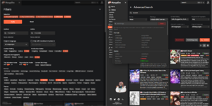
2023-11-06 04_58_31.png

And in general, minor things like the year selection not being a text input fall under the "needs some tweaking" which almost all features need at first. Another one is the "1 extra click to open the dropdown". If it is a hill that you (and/or others) feel extremely strongly about, this is also tweakable, for example by having it open automatically on hover. On making the dropdown view bigger by default (if scrolling is the issue).
 
Dex-chan lover
Joined
May 23, 2019
Messages
2,776
I like the new search system, but it seems there may be a legacy search faction shaping up now...:worry:
 
Joined
Nov 4, 2023
Messages
3
Thank you for returning inclusion/exclusion options! While I still feel that the old search format is better because it doesn’t take up space on top of every page of your search after you’re already done setting your terms, I can live without it. It sounds like you intend to continue developing it so maybe you’ll prove me wrong once it’s finished. An option to expand/collapse the advanced search while keeping the new orientation for the page might be a good compromise but I’m no web dev.

Just one more bit of feedback; say you set up an advanced search, toggling inclusion to “or” instead of the default “and”, and hit search. Then, you realize you forgot to set one part of your search term, so you make the necessary change and hit the search button again, suddenly having few or no results. Right now, you have to go back and change that “and” to “or” again, every time you modify a search, because just that variable will return to default which doesn’t feel correct since everything else you toggled is still active.
 
Abolish Harems
Staff
Developer
Joined
Jun 4, 2019
Messages
238
This is just plain bad UI. Period.

It took visible tag selections that could be chosen quickly, and hid them all behind a drop down menu. Why are some menus scrolled lists, while others, with almost the exact same include/exclude/reset functionality, left as they were? Why is the year selection not just a character entry field?

What was the reasoning behind doing this? Will it improve something on the backend? Will it reduce screen space by some appreciable amount? (use a real computer and stop making everyone else suffer with mobile design, thanks) Who asked for this?

You should roll it back, and seriously reconsider significantly modifying heavily used site functionality without valid reasons.


Do not remove elements of UI just because you don't use them. Ask. Communicate. This is the platonic ideal of bad web design and leads to terrible interfaces hated by everyone except the one single designer who sees nothing wrong because it works on their machine for their preferences.
I won't argue on UI opinions. I strongly believe this is better. And the staff members unanimously think so too. But in the end it's all opinions. However, the voices to improve the advanced search were too loud for too long, and too many. The reasons being nothing but practical.

The number one issue with the old search was it being not intuitive. At all. Closing the modal would have the same effect as the "apply" button. The tag list was long and unstructured, making it extremely hard to look for the tag you want unless you've used it a lot. Clicking on any tag to include/exclude it would prepend an icon on the left, creating layout shifts that oftentimes resulted in tags wrapping in the below line. With all the stuff we kept adding, it became ever clattered.

From our side, we had to do something. I had the redesign up for preview on our canary site for 3 months. During that time I've cooperated with the community for feedback and implemented almost every single one of the ideas we got to improve it, trying to keep as many happy as I could. We did not push it on a whim. People liked it. The dominating opinion was that it is a significant improvement from the old one.

I had asked plenty of people in the server about the inclusion/exclusion mode, and didn't get any replies that it is useful. What I did wrong was that my sample size was too small. I admit it. It won't happen again. From now on, before changing how features work, or removing them, I will make sure to make polls in this forum. Later, we'll implement some kind of way for us to know which parts of the UI people interact with.

In regards to the UI updating, I'm sorry to say that it will keep going. The UI shall always reflect our own views on what looks best for MD. This is also the reason we will likely not have polls for UI updates, unless we're completely impartial to any of two or three variations, which is unlikely, but you never know.

People don't like change. I'm aware of it. I'm also nostalgic to the v3 design and could see myself going back to it. But that's no option. We're also not making changes for the sake of it. We're making changes that we genuinely believe are better. If you disagree with us, then there's honestly nothing I can do about that.
 
Abolish Harems
Staff
Developer
Joined
Jun 4, 2019
Messages
238
I'm going to have to agree with the others on the new tag menu, without being too inflammatory, it is horrible and barely usable.

I am actually struggling to articulate how I feel about this update without it sounding like I'm personally attacking the designer, I actually hate it that much...

Death to drop down menus!
You don't have to feel bad about personally attacking a person that does not exist.
 
Joined
Nov 27, 2019
Messages
16
I personally have to say I liked the previous UI more; I don't really like how everything is behind dropdowns; I found it much more convenient to have all the options displayed at once and being able to select from there. I don't know if such a thing would be possible but it would be nice to have the option to use a legacy version of the search menu
 
Dex-chan lover
Joined
Dec 28, 2018
Messages
256
First, and quickly, about the AND/OR inclusion/exclusion modes and other specifics:


It was an oversight and was added back already. The ability to pick tag inclusion/exclusion mode is not going away, but is a very rarely used feature, which didn't deserve 1st-class space on a very prominent piece of the website. And no one argued against this during the (nearly 2 weeks long) public preview of the update.

This is our chance to say that:
  • yes, we do communicate with interested community members on upcoming features
  • and have an entire preview version of the site online 24/7 (which is public and accessible by anyone)
  • where every single update goes for a few days at least before hitting the main site

It is at https://canary.mangadex.dev, and we notify of any update pushed there on Discord (in the #frontend-early-access channel). Using the canary version of the site and reporting your thoughts on upcoming features tested there is the best way to shape the future of the site, if you feel very strongly about it.


We should change that, indeed. No one mentioned it and it slipped through the cracks.

---

Now more about the "philosophical" aspects...

Please take a second to realize that there are very many users, and you are just 1 of them (or a handful, to include anyone concurring with you in this thread).

When we have to choose between 2 (or more) approaches, we are always making one side happy, and one side unhappy; there's simply no way to satisfy everyone ever.
So it is not personal, nor is it even a "one person in staff prefers this way therefore it is so" deal, because even within staff we regularly disagree.

In this case however, it is our belief that the new layout is strictly better, or at least a better base to improve upon.
Even if it requires 1 more click to open the tag dropdown.

View attachment 308

And in general, minor things like the year selection not being a text input fall under the "needs some tweaking" which almost all features need at first. Another one is the "1 extra click to open the dropdown". If it is a hill that you (and/or others) feel extremely strongly about, this is also tweakable, for example by having it open automatically on hover. On making the dropdown view bigger by default (if scrolling is the issue).
This is literally the first time I have heard about "canary". Perhaps you need to have a better system of public beta testing than it being displayed on the bottom of a filing cabinet in the basement of the website.

Please take a second to realize that there are very many users, and you are just 1 of them (or a handful, to include anyone concurring with you in this thread).
Here come the goalposts! "You're just one person disagreeing, whoops I mean just a few people in this thread, well maybe I mean there really aren't that many of-" ...Whoop there they go!
In this case however, it is our belief that the new layout is strictly better, or at least a better base to improve upon.
Even if it requires 1 more click to open the tag dropdown.
Literally in the image you posted, the tags are more visible, easier to read, and again, don't require an initial click to see. And it isn't "1 more click". It is an extra click to select every. single. element. Content rating, publication status, demographic, etc. This is pants of head refusal to see reality in the face of criticism over a bad decision.

I won't argue on UI opinions. I strongly believe this is better. And the staff members unanimously think so too. But in the end it's all opinions. However, the voices to improve the advanced search were too loud for too long, and too many. The reasons being nothing but practical.

The number one issue with the old search was it being not intuitive. At all. Closing the modal would have the same effect as the "apply" button. The tag list was long and unstructured, making it extremely hard to look for the tag you want unless you've used it a lot. Clicking on any tag to include/exclude it would prepend an icon on the left, creating layout shifts that oftentimes resulted in tags wrapping in the below line. With all the stuff we kept adding, it became ever clattered.

From our side, we had to do something. I had the redesign up for preview on our canary site for 3 months. During that time I've cooperated with the community for feedback and implemented almost every single one of the ideas we got to improve it, trying to keep as many happy as I could. We did not push it on a whim. People liked it. The dominating opinion was that it is a significant improvement from the old one.

I had asked plenty of people in the server about the inclusion/exclusion mode, and didn't get any replies that it is useful. What I did wrong was that my sample size was too small. I admit it. It won't happen again. From now on, before changing how features work, or removing them, I will make sure to make polls in this forum. Later, we'll implement some kind of way for us to know which parts of the UI people interact with.

In regards to the UI updating, I'm sorry to say that it will keep going. The UI shall always reflect our own views on what looks best for MD. This is also the reason we will likely not have polls for UI updates, unless we're completely impartial to any of two or three variations, which is unlikely, but you never know.

People don't like change. I'm aware of it. I'm also nostalgic to the v3 design and could see myself going back to it. But that's no option. We're also not making changes for the sake of it. We're making changes that we genuinely believe are better. If you disagree with us, then there's honestly nothing I can do about that.
Oooooh you asked the Discord. That's why literally nobody heard about it and you only got positive feedback, it was only the clique that hangs around and kisses up in the little special club no one else cares about because they have lives outside of singular websites.
The tag list was long and unstructured, making it extremely hard to look for the tag you want unless you've used it a lot. Clicking on any tag to include/exclude it would prepend an icon on the left, creating layout shifts that oftentimes resulted in tags wrapping in the below line. With all the stuff we kept adding, it became ever clattered.
Exactly what I thought, this was a mobile design decision. Hence the idiocy in thinking drop down menus are better than the extant design.

It's very clear you aren't going to roll this back because somebody on staff made it, user complaints are just a minority of whiners, blah blah blah. But it won't change the fact this was a bad design choice made for no reason other than a web "dev" forcing it to fit their own personal experience while using a bad interface that's actually responsible for the problems they're having.
 
Power Uploader
Joined
Jan 8, 2023
Messages
60
This is literally the first time I have heard about "canary". Perhaps you need to have a better system of public beta testing than it being displayed on the bottom of a filing cabinet in the basement of the website.


Here come the goalposts! "You're just one person disagreeing, whoops I mean just a few people in this thread, well maybe I mean there really aren't that many of-" ...Whoop there they go!

Literally in the image you posted, the tags are more visible, easier to read, and again, don't require an initial click to see. And it isn't "1 more click". It is an extra click to select every. single. element. Content rating, publication status, demographic, etc. This is pants of head refusal to see reality in the face of criticism over a bad decision.


Oooooh you asked the Discord. That's why literally nobody heard about it and you only got positive feedback, it was only the clique that hangs around and kisses up in the little special club no one else cares about because they have lives outside of singular websites.

Exactly what I thought, this was a mobile design decision. Hence the idiocy in thinking drop down menus are better than the extant design.

It's very clear you aren't going to roll this back because somebody on staff made it, user complaints are just a minority of whiners, blah blah blah. But it won't change the fact this was a bad design choice made for no reason other than a web "dev" forcing it to fit their own personal experience while using a bad interface that's actually responsible for the problems they're having.
profile picture checks out, calm down grandpa
 
Contributor
Joined
Jan 19, 2018
Messages
446
Man if only this guy had seen all the complaints about how confusing the previous search was.

Not going to say it's perfect and others can attest that I gave some critical feedback but I still think it's a step in the right direction
 
Abolish Harems
Staff
Developer
Joined
Jun 4, 2019
Messages
238
Oooooh you asked the Discord. That's why literally nobody heard about it and you only got positive feedback, it was only the clique that hangs around and kisses up in the little special club no one else cares about because they have lives outside of singular websites.
Damn right. Why else do you think an entire announcement for it on the main site was never made beforehand, to invite people to try out the redesigned UI for the advanced search?

Do you believe we care about listening to the broader community's opinions before we release something on the main site? Lmao no. I mean, sure, we may have created https://sandbox.mangadex.dev (dev FE, dev BE) and https://canary.mangadex.dev (dev FE, prod BE), to preview nightly-ish builds of our site before we release them to the main site, and even created dev-only replicas of our databases. But that's merely for the convenience of our people on Discord and nothing else (yes, really). We did not intend to make those two sites public at first because that would mean people we can't trust to give only positive feedback could usher in, it was just easier that way.

Unlike you, the folk on Discord never have anything negative to say about the ideas we bring to the table, and neither do they care about the usability of new or redesigned features.

Why waste my time listening to negative advice that will end up making me reimplement the whole thing from scratch? That's just nothing but a waste of time.
 
Joined
Dec 10, 2018
Messages
61
I think the most urgently needed option regarding the advanced search is giving us the possibility of remembering or past choices.

There is never going to be a situation were I want any manga that doesn't have chapters in the languages that I know. There is going to be almost no occasions were I want to search for a manga with the isekai tag, not do I care about doujinshis, etc. So having to choose all those options every time I am searching for new mangas is a chore.

Give us the option to save our preferences!
 
Abolish Harems
Staff
Developer
Joined
Jun 4, 2019
Messages
238
I think the most urgently needed option regarding the advanced search is giving us the possibility of remembering or past choices.

There is never going to be a situation were I want any manga that doesn't have chapters in the languages that I know. There is going to be almost no occasions were I want to search for a manga with the isekai tag, not do I care about doujinshis, etc. So having to choose all those options every time I am searching for new mangas is a chore.

Give us the option to save our preferences!
That is indeed a very good idea. I was thinking of having something like this with the omni search as well (remembering past search text). I have it in mind, not sure how quickly that'll be implemented, but yeah.
 

Users who are viewing this thread

Top