
Dex-chan lover
- Joined
- May 9, 2023
- Messages
- 505
Shit was mid nglYooo they made a fate doujin im tapping in on that rn
Shit was mid nglYooo they made a fate doujin im tapping in on that rn


welcome to the club @Oobaka-san!!Done

indeed its called Date A Live spirit echoDATE A LIVE HAS A GACHA GAME????? I thought they only did collabs and stuff

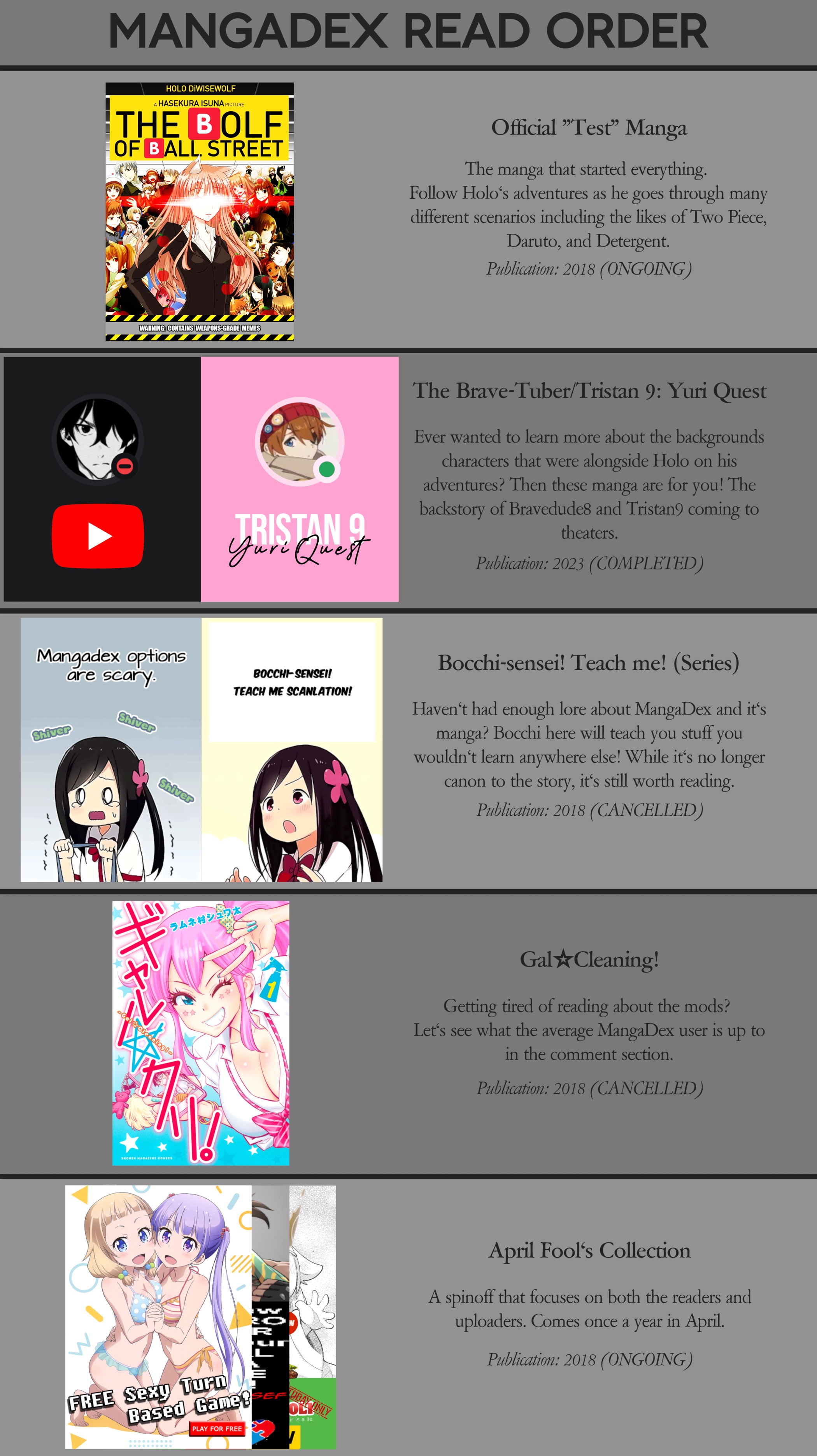

Grapara?@Mangamoz @bigtiddyoneesan
I was bored and made that little joke we made into an actual thing. If you have any suggestions, shoot.
Maybe Add solo leveling? Or "TheSeer" with a blank photo, that has the Roland lore-nya...@Mangamoz @bigtiddyoneesan
I was bored and made that little joke we made into an actual thing. If you have any suggestions, shoot.
We'll see where it goes before I add it.Grapara?
Suggestion accepted.Maybe Add solo leveling?
No.Or "TheSeer" with a blank photo, that has the Roland lore-nya...
The Big Bees, of course! Also, this horrible mess of a manga. I see potential...@Mangamoz @bigtiddyoneesan
I was bored and made that little joke we made into an actual thing. If you have any suggestions, shoot.
That's peak cinema-nya
maybe move the text in bubble five a bit down-nya, to center it-nya. And the fourth one too...I can't put my fingers but something definitely looks off in the typesetting, I'm not sure how to fix it, any suggestions??

Biggest problem I see is the first textbox, the rest is passable. Use a hyphen and maybe a slightly smaller font size like in the third box or try to make the box a little bit wider for fun.I can't put my fingers but something definitely looks off in the typesetting, I'm not sure how to fix it, any suggestions??

Oh come ON!! Everyone and their mom gets a title except for me for some reasons!!!welcome to the club @Oobaka-san!!


Make it so that the text isn't too close to the borders of the boxes / bubbles. For this, either shrink the font or use more line breaks.I can't put my fingers but something definitely looks off in the typesetting, I'm not sure how to fix it, any suggestions??
I've been trying to make the box wider but it ends up looking weird!! but if I try to fit the text properly, it ends up breaching the box, I am stuck between a rock and a hard place for the last 45 minutes!!!Biggest problem I see is the first textbox, the rest is passable. Use a hyphen and maybe a slightly smaller font or try to make the box a little bit wider for fun.

Just ask the mods nicely, they'll give you one-nya.Oh come ON!! Everyone and their mom gets a title except for me for some reasons!!!
Noted!! But too many line breaks can make the text line quite ugly, y'know...Make it so that the text isn't too close to the borders of the boxes / bubbles. For this, either shrink the font or use more line breaks.
Also center the text so that the space above and below are equal


