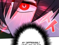
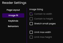
Thx for the illustration, but I was already aware of what it would look like. I have also been through all of the settings. I promise, I do understand the issue.
I already stated a reason: disability/accessibility. If you need something more specific: central vertigo.
You know what's worse than a broken experience? No experience. There are some readers with inner-ear-related conditions that can only choose between a) triggering an episode because scrolling by itself can induce dizziness, but having to process the amount of white space often found in long strips while scrolling can be 10x worse and serve as an express train straight to a full-on blackout or b) not reading the title at all.
When it comes to using a website, if someone has to choose between their health or nothing, then there is an accessibility issue.
All I'm asking is that you give these readers a third option: an imperfect, but serviceable (for those that need it) experience. One man's trash is another man's treasure. Yes, let them be deliberate about choosing the ugly one. Even if you consider it broken, it might be the only way some people will get to read certain titles at all. In this respect, it's the same thing as allowing terrible translations to remain on the site. If someone can choose to read a bad translation, then they can also choose to read using a less than optimal format. Less than stellar is often better than nothing at all.
If the team prefers to prioritize aesthetics over accessibility, then, so be it; I won't ask any further. Though, if you take nothing else from this exchange, at least understand that it isn't your place to tell a person with a disability what is or what isn't accessible.
Thx.


