You are using an out of date browser. It may not display this or other websites correctly.
You should upgrade or use an alternative browser.
You should upgrade or use an alternative browser.
MangaDex v3 is coming!
- Thread starter Holo
- Start date
- Status
- Not open for further replies.
Contributor
- Joined
- Jan 19, 2018
- Messages
- 2,996
The new reader's pretty cool! Very slick looking. I like all the new options, and it seems like something that can work on both mobile and desktop. Sometimes there's an "end of JSON" error, but that's something that'll probably be fixed later.
Just a small QOL problem though– whenever I switch page layouts or anything like that, it jumps two or three pages
Just a small QOL problem though– whenever I switch page layouts or anything like that, it jumps two or three pages
- Joined
- Jan 19, 2018
- Messages
- 2,863
Yes, the reader can be a bit of a buggy mess right now in some respects since it was put up as a test for the beta site. I wasn't expecting Holo to make it public quite yet.
2) I've had a couple of people suggest changing pages through scrolling, so I'll see what I can do about that.
I might bring hiding it back in some form if there's a reasonable way to do it.
Your concerns about the direction don't make much sense to me. I don't understand if you're talking about some bug or if you're just confused that changing the direction changes the direction.
code in the sidebar is meant just as a reminder that you can use the shift as well, the exact keyboard shortcuts are described under the settings.
on a monospace font would've been way too long.
And yeah switching between rendering modes and stuff is kind of buggy at the moment, although with the lazy loading way long strip is implemented also means it's not exactly simple to make it perfect.
1) A good suggestion, and I already implemented it so you'll see that whenever the next update gets rolled out.@joe posted:
1)
I always wonder why manga/comic readers (web based or native app) support various configurations such as limit image to container/screen height/width but always lack an option to set a specific resolution. For example, I can't stand when images are fit to screen height because in my mind it always spoils whole page and I miss out on this feeling of progression where you read a block, scroll down, read another block, potentially scroll up and so on.
I guess what I am saying is: are there plans to add an option(s) such as "Fit to width but no more than x px", same with height. It wouldn't stretch smaller images but would resize bigger ones.
2)
I love scrolling images with spacebar. Can we have an option where if we reached the end of the page additional press on scrollbar would open next page/chapter. And shift+scrollbar would open previous page/chapter.
2) I've had a couple of people suggest changing pages through scrolling, so I'll see what I can do about that.
I did originally make it so hiding the top nav hid the page track as well, but I realized I would actually need to make it yet another separate option, it didn't actually give *that* much more space and two hideable elements are frankly quite enough for the average user to deal with already. Instead I made the track even smaller and expandable on hover, so it's only 15 damn pixels.@koneko posted:
However, while I'm glad there's still an option to hide the top nav-bar, can you also add an option to hide the bottom track bar? When reading manga, I highly value my vertical space. The track bar at the bottom is fairly small (when you're mouse isn't over it), but it's constantly there, eating up our precious vertical real estate.
I might bring hiding it back in some form if there's a reasonable way to do it.
I'm absolutely not going to make "No resize" the default option, I can't believe anybody would want to scroll through 4000px height images as their default viewing mode.@ImperfectScans posted:
The only concern here is that the default is Resized, it should be at its default size
A second concern is the Direction option, this doesn't make much sense, I tried it and it's confusing, probably this was made for the "read from left to right and right to left" but it's just confusing and also the reader keep going back and fourth on 2 pages. The Last one and the First one.
Your concerns about the direction don't make much sense to me. I don't understand if you're talking about some bug or if you're just confused that changing the direction changes the direction.
I can understand if it's currently slightly slower to load initially, but there's absolutely no way it's slower when changing from one chapter to another (or in the future one manga to another), for example. You say the reader elements are distracting, but also want more rainbow colors in it. The@eli posted:
- Reader is way too busy. It's slower to load and feels like it's going the "HTML5" route of a bunch of unnecessary stuff, animation, etc. when I just want something simple. This is the very reason I download all of my manga and just use a regular image viewer on my computer/phone. The black bar on the bottom is distracting and unnecessary, the code on the sidebar is wrong (just plain works for me on Mac, no shift required), and it's distracting with the bar on the right as others have said. Plus, the manga pages are smaller on my already-small laptop screen. It also feels like all the color of the old site is gone – the settings page (which needs padding between the buttons, btw) is all grayscale. These buttons are also a different style than those used for search/settings (with a slight gradient) which isn't good for consistency.
Code:
^f
Code:
(^)fSure, I had just forgotten to implement it before putting it on the beta.@RGFalcon posted:
Keeping the side bar hidden if I have already hidden it between manga is also needed.
Those errors come from the whole site not loading properly currently, it's not really related to the reader itself. Making the error messages more descriptive is on the todo list, as I figure out what kind of errors may be coming up.@Ceiye posted:
The new reader's pretty cool! Very slick looking. I like all the new options, and it seems like something that can work on both mobile and desktop. Sometimes there's an "end of JSON" error, but that's something that'll probably be fixed later.
Just a small QOL problem though– whenever I switch page layouts or anything like that, it jumps two or three pages
And yeah switching between rendering modes and stuff is kind of buggy at the moment, although with the lazy loading way long strip is implemented also means it's not exactly simple to make it perfect.
Group Leader
- Joined
- Jan 25, 2018
- Messages
- 31
@Teasday
You are taking the extremes one, never take extremes examples. Usually pages are resized to around 1200-1400, with some rare exception in the 1600 rage, going for 4k is rather too much and more or less "raw" but there are those who prefer to release in that kind of resolution. Also as of now the page are resized to fit the screen completely, so reading on a small screen strain the eyes. This can simply to solved by adding a restrain past 1.6k and give a notice about it if the restrain is used. (On a unrelated note: By resizing the page that extreme, it's basically the same as other aggerator sites (decrease the quality of the work) and going agaisn't what this site is for? Which is a successor of batoto as it was marketed unless that changes). Also I gave a reason for why to not use resized and it looks like you just discarded it based on your reply, as a designer who seek feedback on their work, never discard and take things out of context.
Well it doesn't make much sense to me to begin with, I tried it and it keep switching between the first page and the last page for me, clearly it's bugged? Also what is that option for? Going backwards or something?
Well those are my 2 cents as I'm not here to argue but to give feedback.
I'm absolutely not going to make "No resize" the default option, I can't believe anybody would want to scroll through 4000px height images as their default viewing mode.
Your concerns about the direction don't make much sense to me. I don't understand if you're talking about some bug or if you're just confused that changing the direction changes the direction.
You are taking the extremes one, never take extremes examples. Usually pages are resized to around 1200-1400, with some rare exception in the 1600 rage, going for 4k is rather too much and more or less "raw" but there are those who prefer to release in that kind of resolution. Also as of now the page are resized to fit the screen completely, so reading on a small screen strain the eyes. This can simply to solved by adding a restrain past 1.6k and give a notice about it if the restrain is used. (On a unrelated note: By resizing the page that extreme, it's basically the same as other aggerator sites (decrease the quality of the work) and going agaisn't what this site is for? Which is a successor of batoto as it was marketed unless that changes). Also I gave a reason for why to not use resized and it looks like you just discarded it based on your reply, as a designer who seek feedback on their work, never discard and take things out of context.
Well it doesn't make much sense to me to begin with, I tried it and it keep switching between the first page and the last page for me, clearly it's bugged? Also what is that option for? Going backwards or something?
Well those are my 2 cents as I'm not here to argue but to give feedback.
- Joined
- Jan 19, 2018
- Messages
- 2,863
If eyestrain is somehow a problem, all you have to do is change the display fit or zoom in on the image, what the default setting happens to be has no bearing on it. The first impression is the important one, and if a new user is immediately greeted with scrollbars both vertically and horizontally, they're not likely to have a good reaction.ImperfectScans posted:
You are taking the extremes one, never take extremes examples. Usually pages are resized to around 1200-1400, with some rare exception in the 1600 rage, going for 4k is rather too much and more or less "raw" but there are those who prefer to release in that kind of resolution. Also as of now the page are resized to fit the screen completely, so reading on a small screen strain the eyes. This can simply to solved by adding a restrain past 1.6k and give a notice about it if the restrain is used. (On a unrelated note: By resizing the page that extreme, it's basically the same as other aggerator sites (decrease the quality of the work) and going agaisn't what this site is for? Which is a successor of batoto as it was marketed unless that changes).
Well it doesn't make much sense to me to begin with, I tried it and it keep switching between the first page and the last page for me, clearly it's bugged? Also what is that option for? Going backwards or something?
Aggregator sites resizing pages is completely unrelated, since the problem with them is that they actually edit and diminish the image files' dimensions instead of simply displaying full source images at a smaller size. I'm doing absolutely nothing to decrease the quality of the images.
I'm not sure how you conclude that the direction setting is clearly bugged, yet the very next sentence you ask what it's even meant for. As the name implies, it's for changing the reading direction of the pages. Think of it as if you're reading an actual physical book. On "left to right", moving to the right advances the pages forward. On "right to left", moving to the left advances them instead. As I'm sure you know, manga are very typically read right to left, so that would be the direction forwards. On the double page rendering mode, the pages switch places exactly because you're changing the direction you're supposed to be reading them in. This is especially useful in cases where a double page spread has been split into two different images, allowing you to display them both side by side in the correct order.
Aggregator gang
- Joined
- Jan 25, 2018
- Messages
- 75
Thank you for not just including a double page viewer, but one that works well. It detects page spreads well, and has an easily accessible option to fix odd/even display issues. Maybe in the future there could be some way for people to set if a page should start odd or even, so when other people visit the chapter they don't have to switch it manually at all.
As far as other suggestions go, I would prefer if, when using double page view, it would display single first/last pages to one side instead of centering them. Even better would be an option to display the adjacent page from the previous/next chapter, or if not that, a placeholder page that it could load into and replace once you click it. Having any extra indication at all in the reader space that it's the start or end of a chapter would be useful anyway, aside from having just the bottom bar to go from.
As far as other suggestions go, I would prefer if, when using double page view, it would display single first/last pages to one side instead of centering them. Even better would be an option to display the adjacent page from the previous/next chapter, or if not that, a placeholder page that it could load into and replace once you click it. Having any extra indication at all in the reader space that it's the start or end of a chapter would be useful anyway, aside from having just the bottom bar to go from.
Fed-Kun's army
- Joined
- Jan 18, 2018
- Messages
- 31
Please stop what you're doing, this is ugly, it looks like a scraper site. the reader as well is horrible what was wrong with the old reader.
Group Leader
- Joined
- Jan 25, 2018
- Messages
- 31
@Teasday
So that thing was to mimic that like I stated in the first post though your first reply gave me a different impression, anyway, like I said before, when I tried that, upon clicking one the page for the next page it just switches between the first page of the chapter and the last page of the chapter which got me confused as to what it does.
While I agreed with you that the aggregator site compress the work, but by resize it that extreme, it changes the pattern and thus the tone of HQ works but anyway most readers don't notice that so be my guess and since there are option to change so that take care of that.
Anyway, those are all the feedback I can come up with. peace out
- Joined
- Jun 16, 2018
- Messages
- 8
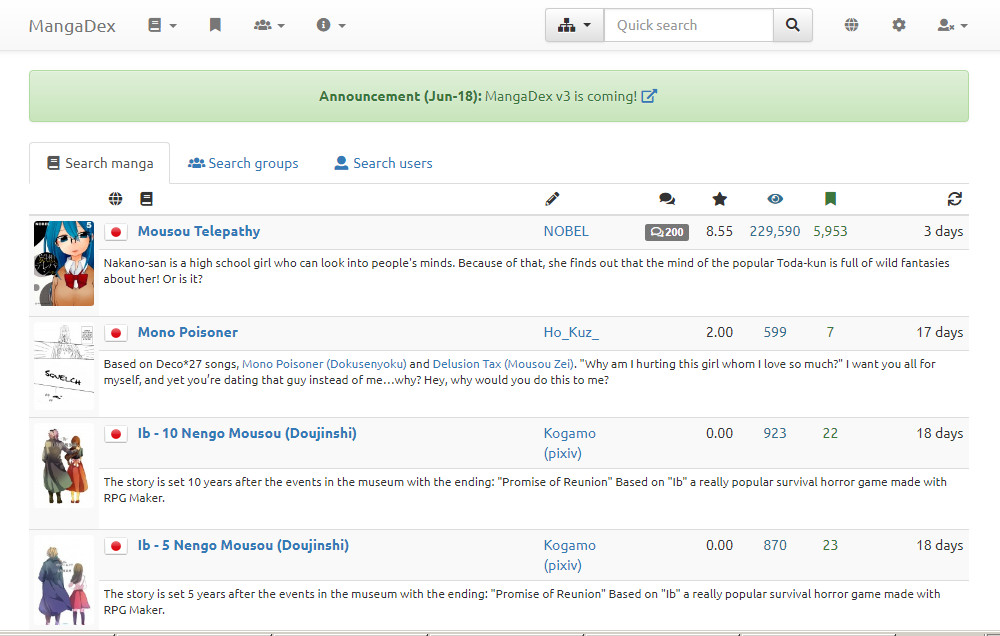
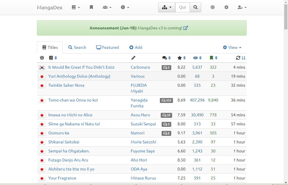
I like the 'sort' function on the titles page, it makes it easier to find whats popular.
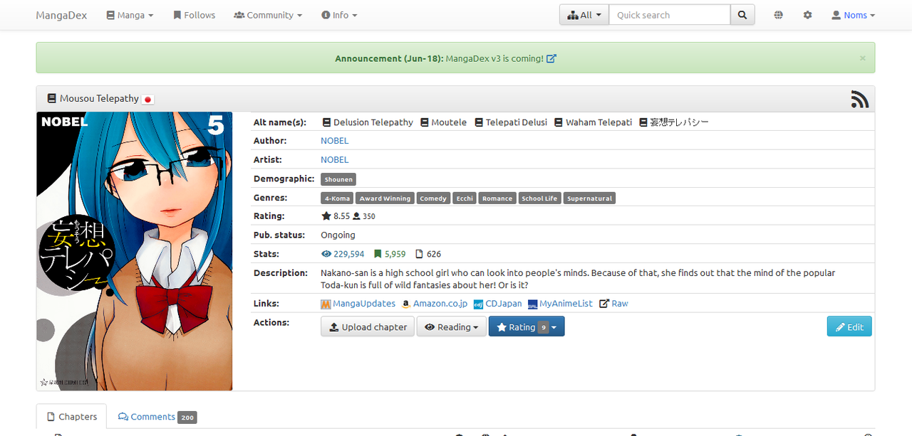
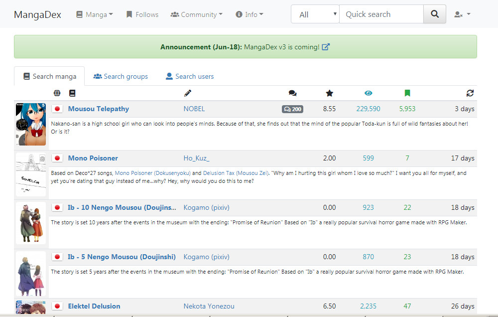
Some feedback related to styling:
I use the default bootstrap light theme regularly. There are a few changes in the updated them on beta that I don't like.
[*] Large padding wastes space
You can see the difference between the cover image and info, between the info category (e.g. "Demographic:") and the data (e.g. "Shounen).

- links to static: and
and

This doesn't affect buttons, so it shouldn't harm mobile fat fingers.
With a smaller window, this makes it look more squished. Same window size for both below:
- click for bigger: (old) vs.
 (beta)
[*] Font choice of old style is easier to read. Lettering in the beta one is thinner. The grey bubble (?) around the tags used to be a little bigger, too (unless this is a side effect of the different font) - made it easier to look at.
-see images above
- quick search, click for bigger: old vs. beta

- chapter listing, click for bigger:

Edit: Rendering as arial (non-beta) vs. segoe (beta) on my comp.
[*] Bright font colours are distracting and harder to read. I don't think the rating and stats are so important that they should keep drawing my attention with the bright colours. ? Is this what bootstrap 4 came like or is it a compromise for dark theme? I hear there's going to be multiple themes, so it can be adjustable in each stylesheet - at most it'd be twice (once for the light themes, once for the dark themes)?
Follows: green - old #3C763D, beta #28A745
Views: old blue #31708f vs. beta cyan #17a2b8
Rating old black vs. beta a different blue #007BFF
Also see images above.
[*] Column widths need tweaking. It seems like the Title column has gotten shorter while the Author column has gotten longer. In the example below, beta now has excessive white space, so the dimensions need a better balance - shorten author a little and lengthen title a little.
Titles can be long and bolding the title also has the side effect of further reducing the length that fits in, so a little more visibility will be helpful - especiaily for mobile (most can do tooltips).
- click for bigger: old vs. beta

Sorry I keep saying "old" whenever I refer to the current layout.
Edited for mistakes.
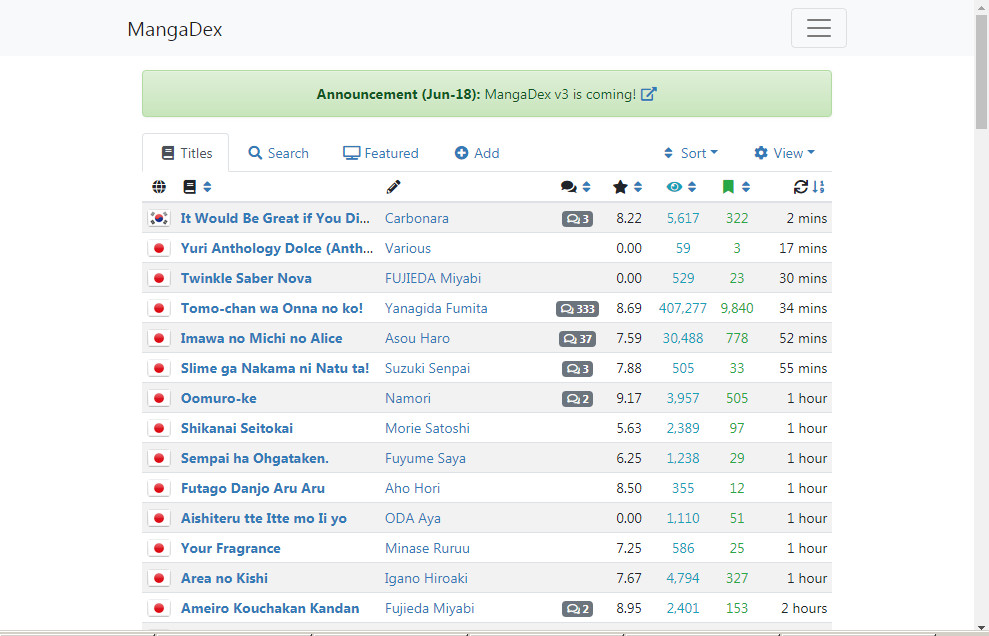
I use the default bootstrap light theme regularly. There are a few changes in the updated them on beta that I don't like.
[*] Large padding wastes space
You can see the difference between the cover image and info, between the info category (e.g. "Demographic:") and the data (e.g. "Shounen).
- links to static:
 and
and
This doesn't affect buttons, so it shouldn't harm mobile fat fingers.
With a smaller window, this makes it look more squished. Same window size for both below:
- click for bigger:
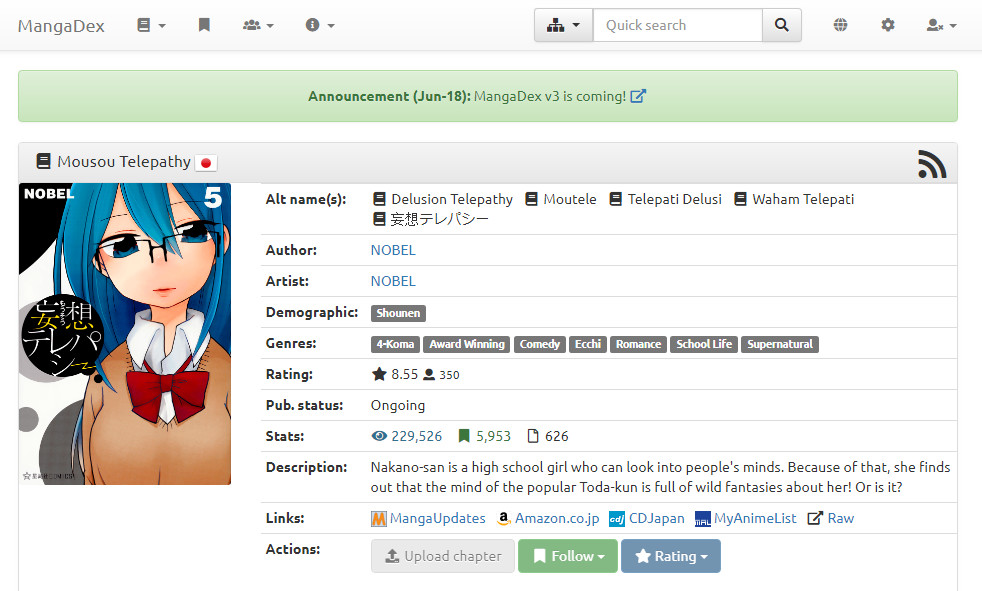 (old) vs.
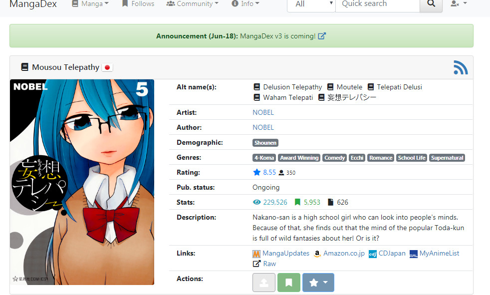 (beta)
[*] Font choice of old style is easier to read. Lettering in the beta one is thinner. The grey bubble (?) around the tags used to be a little bigger, too (unless this is a side effect of the different font) - made it easier to look at.
-see images above
- quick search, click for bigger: old
 vs. beta
- chapter listing, click for bigger:
Edit: Rendering as arial (non-beta) vs. segoe (beta) on my comp.
[*] Bright font colours are distracting and harder to read. I don't think the rating and stats are so important that they should keep drawing my attention with the bright colours. ? Is this what bootstrap 4 came like or is it a compromise for dark theme? I hear there's going to be multiple themes, so it can be adjustable in each stylesheet - at most it'd be twice (once for the light themes, once for the dark themes)?
Follows: green - old #3C763D, beta #28A745
Views: old blue #31708f vs. beta cyan #17a2b8
Rating old black vs. beta a different blue #007BFF
Also see images above.
[*] Column widths need tweaking. It seems like the Title column has gotten shorter while the Author column has gotten longer. In the example below, beta now has excessive white space, so the dimensions need a better balance - shorten author a little and lengthen title a little.
Titles can be long and bolding the title also has the side effect of further reducing the length that fits in, so a little more visibility will be helpful - especiaily for mobile (most can do tooltips).
- click for bigger: old
 vs. beta
Sorry I keep saying "old" whenever I refer to the current layout.
Edited for mistakes.
- Joined
- May 7, 2018
- Messages
- 67
Beta looks generally ok. Nice that the carousel on the homepage is easier to use.
It's also great how you can tab between Latest updates and Follows there.
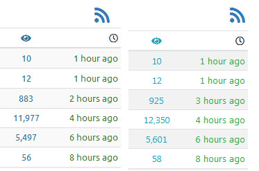
Generally while the homepage is packed with more info. I think the bigger problem is not the layout but the use of colour. The brighter blue of the tabs and rating competes is too vibrant for the eyes. It should be a tone similar or softer than the green announcements bar. Top chapters can also return to its previous width. Also, New Titles seems to be an after thought the way it's placed at the bottom.
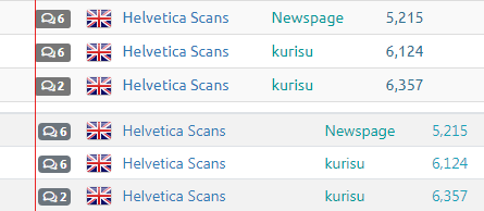
One thing that would be nice is to add is the last uploaded chapter number to the stats, so when you quick search a title, this is displayed next to the comments, rating, views and follows.
Like users before me said: How the languages are grouped on the title's page can use an upgrade.
It's also great how you can tab between Latest updates and Follows there.
Generally while the homepage is packed with more info. I think the bigger problem is not the layout but the use of colour. The brighter blue of the tabs and rating competes is too vibrant for the eyes. It should be a tone similar or softer than the green announcements bar. Top chapters can also return to its previous width. Also, New Titles seems to be an after thought the way it's placed at the bottom.
One thing that would be nice is to add is the last uploaded chapter number to the stats, so when you quick search a title, this is displayed next to the comments, rating, views and follows.
Like users before me said: How the languages are grouped on the title's page can use an upgrade.
- Joined
- Jan 29, 2018
- Messages
- 1
Hello I'm liking v3 so far but would it be possible to give random its own thing instead of in the manga drop down, a thing i liked doing on batoto was to just keep clicking random to see what i would get so it would smooth the process a lot if it was up there as well, if that's not possible then its no biggie i can deal with it.
- Status
- Not open for further replies.
Similar threads
- 128
- Replies
- 129
- Views
- Locked
- Suggestion
- 0
- Replies
- 1
- Views
- 2K
- Replies
- 2K
- Views
Users who are viewing this thread
Total: 2 (members: 0, guests: 2)