MangaDex v3 is coming!

Status
Not open for further replies.
Contributor
Joined
Feb 6, 2018
Messages
25
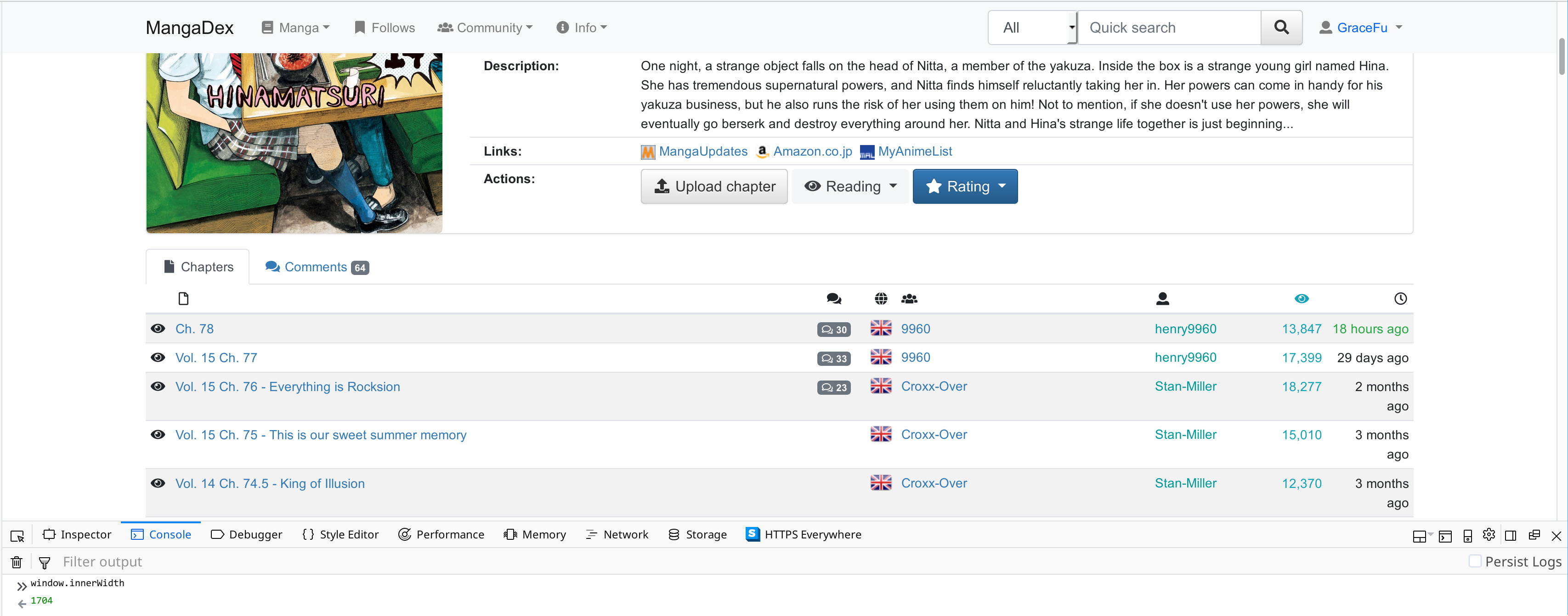
I kinda prefer the old reader - the new one definitely has some more useful features, but to me it's a little busy looking and I like the simplicity of the old reader where it was just an image and some nav buttons above + below. The new one seems a little over complicated to me. The homepage too, I find to be a little busy looking. The old site was just like, "here's some new manga," but this one's like "HERE'S ALL THE INFORMATION YOU COULD POSSIBLY EVER NEED." Like, the new comments bit especially, they seem kinda interesting at first but they're really not very useful. I'm only interested in comments on manga I'm actually reading.
I appreciate all the work you guys have put into the new site and I definitely prefer some things from this one but I think some of the simplicity that made the old site so user-friendly has been lost a little. Just my opinion, though.
 
Fed-Kun's army
Joined
Jan 21, 2018
Messages
300
I like the reader (definitely a huge step up IMO), but not sure I like the main page yet. The Follow page hasn't changed, so I'm really okay with that.

I'm not sure why I got the "Object doesn't support property or method 'forEach'" on mobile reader though.

EDIT: I am an idiot. Should've realized rancor1223 already reported this issue. Should not be hard to just change the forEach function with a simple for loop, I suppose.
 
Contributor
Joined
Jan 18, 2018
Messages
56
More database options(Anilist, Kitsu, Anime-Planet) on a manga's page.
Option for sliding transition between pages.
As others have said, the main page is ugly. Aside from the "Featured" slider, the page feels cluttered and messy. Just include the "all" and "follows" tabs to the normal page and it's good enough
 
Active member
Joined
Feb 9, 2018
Messages
326
The new reader is nice, feels like an improvement over the current page change mechanic.

But like some other people here, I'm not happy with the front page. Too many things randomly thrown together.

Also, I'm not really sure you want to put the most recent comments on the front page:
First, there is not much value to a user in seeing random comments from series they might not even be following. Second, it's a good way to get an unexpected spoiler. It does not even have to be on purpose, if someone comments on something that happend in a manga long ago but the user hasn't read yet it could come out as a spoiler even though it isn't one for people who are up-to-date with the series.

Also, it doesn't seem really clear what the distinction between "featured titles" and "top manga" is. Are featured titles picked by someone? By which criteria?
 
Contributor
Joined
Jan 18, 2018
Messages
331
Beta homepage: I can see this as a homepage for non-logged in users, but for logged in users like me, it feels kinda cluttered and overwhelming. Maybe have another version which shows My Follows, segmented into Reading, Plan to Read, etc? I'm more likely to pick up titles that I can see update frequently. :)

The slider version would probably work better for me when combined with a recommendation engine ala-Netflix. But as a list of featured series, hmm, maybe not too much. ^^

Reader: I'd probably hide the keyboard settings behind a Click here link so the Reader Settings won't be too text-heavy.
 
Member
Joined
Apr 29, 2018
Messages
339
Is there any bookmark function yet (not just follow)? I like to know the last chapter I have bookmarked, and have a more compacted display of 'bookmarked vs last release' per manga. Current follow page displays each chapter release of all manga I followed and it's getting cluttered when I have a lot of manga to follow/haven't been reading for more than couple of weeks. It'd be nice to have this kind of display in the manga tab in the follow section...
 
Member
Joined
Jan 20, 2018
Messages
40
Looks cool, but I found a problem. When I click the double page option, the page and sidebar overlap.
 
is a Reindeer
VIP
Joined
Jan 24, 2018
Messages
3,231
@trov34 It's a beta test and there are many predicted known issues, specifically with chrome. Those are one of them. :^(
fixes soon
 
Contributor
Joined
Jan 18, 2018
Messages
1,872
The reader is awesome, maybe need some more polish mmm...

But the main page seems a bit off, the featured title is a nice addition but latest update should still have space priority (unless I can modify it?) and the comment section is like double edge as it can contain spoiler and stuff, since comment is very random mmm...
 
Contributor
Joined
Mar 10, 2018
Messages
3,438
@_das No problem about this, is just my pov about v3, is a matter of preference. Still prefer the actual one but is up to Holo indeed.

Reader is the best part of v3 and the only change i really like. <3
 
Group Leader
Joined
Feb 27, 2018
Messages
31
Where should bug reports be filed?

Manga chapter listing table has visual bug on my screen width:

rOKg4ob.png


Edit:

kTF563X.png


Also, the font is defaulting to Arial, which I personally don't like as much as the current site's font Ubuntu. Are those other fonts higher up in the list supposed to be loaded? I'm curious how Roboto/Segoe UI look.
 

joe

Joined
Mar 3, 2018
Messages
60
Changes are always nice because you can get real feedback from users on new stuff and old stuff. Reader improvements are really nice.
Quick question: is option to exclude certain genres coming with v3 similarly how its done on MangaUpdates (I think it was on batoto too)?

Couple of personal nitpicks
1)
I always wonder why manga/comic readers (web based or native app) support various configurations such as limit image to container/screen height/width but always lack an option to set a specific resolution. For example, I can't stand when images are fit to screen height because in my mind it always spoils whole page and I miss out on this feeling of progression where you read a block, scroll down, read another block, potentially scroll up and so on.
I guess what I am saying is: are there plans to add an option(s) such as "Fit to width but no more than x px", same with height. It wouldn't stretch smaller images but would resize bigger ones.

2)
I love scrolling images with spacebar. Can we have an option where if we reached the end of the page additional press on scrollbar would open next page/chapter. And shift+scrollbar would open previous page/chapter.
 
Dex-chan lover
Joined
Jan 29, 2018
Messages
1,139
Well, personally, I thought of this site's main page as some kind of dashboard.
And dashboard should prioritize to display any recent change to the thing of relevance.
The new main page is nice for newcomer, since that becomes their gateway to the world of manga, but for seasoned users, it's just annoyance since most of the element there barely change over time, and only distract them from what they really want to see.

Though of course, you can always say that Follow page is the true dashboard, but then again, even seasoned user wants to read new things once in a while.

Then again, I don't know anything about website design, so yeah.

Also, please made that snippet keyboard shortcut in the reader sidebar clickable to do the same thing. Just for a bit convenience, and because I somehow always intuitively click on them only to find out it does nothing.
Otherwise, I love the reader. Now I can finally be free from all those scanlators that splits two-page spread.
 
Member
Joined
Jan 26, 2018
Messages
78
Hmmm. I think I prefer the old simpler reader. Less resize options so it always displays the optimal size and I dont have to tinker to start reading
 
Joined
Feb 2, 2018
Messages
12
Going off what others are saying about the home page, I noticed many people called the old one simple and some questioned the need for the extra sections. But I don't think the problem is with the home page having too much stuff. The addition of comments and posts with the featured titles isn't really that much extra. I think the problem is that the new layout they're placed in doesn't have as strong a hierarchy as the old home page, which makes it look more complicated in comparison.

The old one has the "latest updates" as the largest element of the page and everything else is to the side. So people know how to approach and read the page: the latest updates is the most important bit and things like "top chapters" are kind of tangential.

In the new page, it makes sense why the comments and form posts are in their own column. And I can see the problem in having everything other than "latest updates" crammed into a single long column that you have to scroll down. But the new layout also gives all the columns the same width so people see the featured titles as the most important element (since it's at the top) and don't see any other hierarchy from there.

To establish a hierarchy, you could try having the three columns with the "latest updates" column as the widest one, but I have a feeling that'd just make the other two columns look cluttered. So I'd consider trying two columns, with "latest updates" taking up the space of the left-most two columns. And where you have the third column now, you could try having all the other sections as expandable items split into two groups: form and manga. So you have the manga section above the form one, and you'll see the top chapters there as an expandable button. You can click on it and it'd push the rest of the column down. So you'd be able to communicate items as tangential to the main "latest updates" while giving those items the same amount of width they have now (because sidebar in the old home page is pretty cramped), and you'd avoid having a really long side bar that you need to scroll down to see what you want.
 
Joined
Jan 25, 2018
Messages
4
I'm not a huge fan of the new Reader layout (I prefer the simplicity of the old one), but I can probably get used to it.

However, while I'm glad there's still an option to hide the top nav-bar, can you also add an option to hide the bottom track bar? When reading manga, I highly value my vertical space. The track bar at the bottom is fairly small (when you're mouse isn't over it), but it's constantly there, eating up our precious vertical real estate.

As for the new home page, I think the "Latest Manga Comments" section should be removed. Most users aren't reading most manga (that is to say, most users are only reading a handful of the thousands of manga available). This means that most of the comments in that section will likely be for manga that the user isn't reading/interested-in. At the very least, "Latest manga comments" should be below "Latest forum posts" since the forum posts are much more likely to be relevant to the user than the manga comments are.
 
Status
Not open for further replies.

Users who are viewing this thread

Top