You are using an out of date browser. It may not display this or other websites correctly.
You should upgrade or use an alternative browser.
You should upgrade or use an alternative browser.
Legacy reader is officially retired from today.
- Thread starter ixlone
- Start date
- Status
- Not open for further replies.
- Joined
- Jan 24, 2018
- Messages
- 68
great, get rid of the visually simple user interface for the end user that has all the relevant information on the page in favor of an ugly and cluttered sidebar that squishes the image. A+ design decision, i hate it.
Dex-chan HATER
- Joined
- Mar 17, 2019
- Messages
- 10,721
Legacybros BTFOgreat, get rid of the visually simple user interface for the end user that has all the relevant information on the page in favor of an ugly and cluttered sidebar that squishes the image. A+ design decision, i hate it.
Contributor
- Joined
- Jan 18, 2018
- Messages
- 2,136
I actually liked the legacy reader.
It felt less cluttered than the other interface and it was easy on the page load.
Pages were sized to fit in the middle, but now it's less noticeable with the other reader.
This is a shame. It looks like I'll have to get used to the new reader.
It felt less cluttered than the other interface and it was easy on the page load.
Pages were sized to fit in the middle, but now it's less noticeable with the other reader.
This is a shame. It looks like I'll have to get used to the new reader.
Dex-chan lover
- Joined
- Jul 4, 2018
- Messages
- 5,464
Dang it I'm not used to default reader... When will legacy be unusable?
- Joined
- Aug 30, 2019
- Messages
- 1
What is legacy reader? O-O
Member
- Joined
- Jan 18, 2018
- Messages
- 51
Legacy reader? What's that? Been reading the same way since site been launched and had no problem.
Dex-chan lover
- Joined
- Jul 4, 2018
- Messages
- 5,464
Aw come on legacy was literally working a moment ago... sad times...
Dex-chan lover
- Joined
- May 28, 2018
- Messages
- 937
@Blastoutmaria If you've been using the same reader since site launch, then you've been using the legacy reader lol
They changed it a few months in, if I remember correctly.
They changed it a few months in, if I remember correctly.
Group Leader
- Joined
- Aug 13, 2019
- Messages
- 145
Legacy reader was better to use on mobile until the recent changes to the modern reader. Now the modern reader works completely fine on mobile and i guess that's why legacy is being removed. I used the legacy reader on mobile for this reason but switched back to modern after the updates.
Member
- Joined
- May 14, 2019
- Messages
- 53
EDIT: Please add a big PSA to check display settings.
Dex-chan lover
- Joined
- May 28, 2018
- Messages
- 937
Quick question as a new default reader user, I toggled the "hide cursor over images" setting, and yet my cursor pops up as the mickey mouse-looking pointy anywhere it goes, like it's hovering over a button. How do I stop this? It really bothers me.
Dex-chan lover
- Joined
- May 23, 2019
- Messages
- 3,704
I never used legacy, and was a bit surprised to hear it was still hobbling around after the V2 API version reader was launched. 💀
Ironic how they call the GFG members necros! 👻
I think the new reader kicks butt! Thanks for all the hard work Teasday! 😃
Ironic how they call the GFG members necros! 👻
I think the new reader kicks butt! Thanks for all the hard work Teasday! 😃
- Joined
- May 29, 2012
- Messages
- 594
@Greyvenn
Main two causes for slow images currently are new chapters in SEA region due to poor peering on DDG. Other than that if you get a slow md@h client, which is rare as the slower ones lose traffic if they aren't performing well and we have way more bandwidth available than is in use - unless you have poor peering to the client of course. But these are issues that would've been present on legacy, too if that were the case.
My load times via the network range from 150ms-500ms per page on average.

@fullerhorn
You can set up default reader to look exactly the same when reading and have just the page on screen. I personally like to keep the page bar at bottom for easy navigation if I want to go back. You can close the side bar by either clicking the icon or by pressing "t", don't have to keep it open and "squish the image". You'd have to click the X on legacy reader to remove top bar, so it's no different to pressing "t"/clicking the arrow to hide the side bar and it doesn't have the ugly ass buttons at the bottom of the screen that make you scroll past the page height like legacy did.

@Ominous
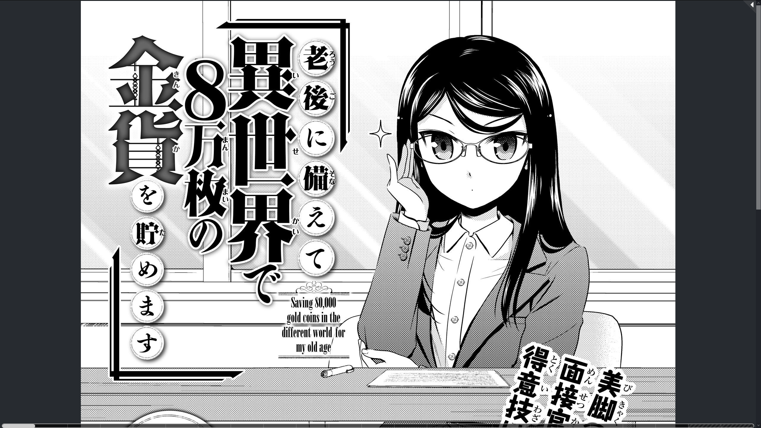
You can make it as uncluttered as you want. See screenshot above.
@winding302
We don't upscale images. Didn't upscale them on legacy either. A page that is 1200px on legacy is 1200px on default. You can set the default to restrict pages by height, or container size, but if the page is "ant sized" it won't hit those limits either. Personally I use width as my setting since I like larger res images to fill up my screen.
Main two causes for slow images currently are new chapters in SEA region due to poor peering on DDG. Other than that if you get a slow md@h client, which is rare as the slower ones lose traffic if they aren't performing well and we have way more bandwidth available than is in use - unless you have poor peering to the client of course. But these are issues that would've been present on legacy, too if that were the case.
My load times via the network range from 150ms-500ms per page on average.

@fullerhorn
You can set up default reader to look exactly the same when reading and have just the page on screen. I personally like to keep the page bar at bottom for easy navigation if I want to go back. You can close the side bar by either clicking the icon or by pressing "t", don't have to keep it open and "squish the image". You'd have to click the X on legacy reader to remove top bar, so it's no different to pressing "t"/clicking the arrow to hide the side bar and it doesn't have the ugly ass buttons at the bottom of the screen that make you scroll past the page height like legacy did.

@Ominous
You can make it as uncluttered as you want. See screenshot above.
@winding302
We don't upscale images. Didn't upscale them on legacy either. A page that is 1200px on legacy is 1200px on default. You can set the default to restrict pages by height, or container size, but if the page is "ant sized" it won't hit those limits either. Personally I use width as my setting since I like larger res images to fill up my screen.
Dex-chan HATER
- Joined
- Mar 17, 2019
- Messages
- 10,721
@MrFakOff
I feel you bro, this is some ass. I found a decent alternative a while back just in case devs decided to pull a stunt like this.
I feel you bro, this is some ass. I found a decent alternative a while back just in case devs decided to pull a stunt like this.
- Joined
- Jan 24, 2018
- Messages
- 68
@ixlone i don't know how to tell you this but having to go from a user interface that had reader options on the page as well as centered, non-squished images to one that forces you to choose between one or the other is bad for the end user, and that page bar that sits at the bottom of a page and covers part of it is uglier than any button on legacy. it's bad enough that users on a website with a forum have to use a third-party script to be able to 'quote' others and have to constantly suggest extremely basic things for a seemingly never-happening 'v5' without site operators removing things that end users either liked or had no idea existed.
Group Leader
- Joined
- Apr 9, 2018
- Messages
- 2,187
- Status
- Not open for further replies.
Similar threads
- Question
- 5
- Replies
- 6
- Views
- Question
- 1
- Replies
- 2
- Views
- 0
- Replies
- 1
- Views
Users who are viewing this thread
Total: 2 (members: 0, guests: 2)