You are using an out of date browser. It may not display this or other websites correctly.
You should upgrade or use an alternative browser.
You should upgrade or use an alternative browser.
Legacy reader is officially retired from today.
- Thread starter ixlone
- Start date
- Status
- Not open for further replies.
@eCinS Then even more people would complain, saying it's complicated and their brain hurts.
Not everyone wants to see chapter comments. Also, putting them there will outright murder the database.
On mobile, this menu is at the top and has no empty space. Sure, devs could add some functionality only for desktop users, but then they'll have to cut it from mobile version or vice versa. This is a huge maintenance headache, which was one of the main reasons why the legacy reader got killed in the first place.
etc-etc.
Active member
- Joined
- Feb 1, 2018
- Messages
- 325
Active member
- Joined
- Jan 19, 2018
- Messages
- 370
The legacy reader is superior as you can access comments and the previous chapter quicker through the buttons on the bottom of the page. Plus, the UI was more enjoyable and cosy enough to provide the feeling of a hug from a small warm blanket (anyone who thinks otherwise is a liar and cannot be trusted).
But the default reader can still be almost as appealing by setting the maximum container width to 500 pixels, setting it to long strip mode, disabling the page clicker, and hoping images don’t fail to load. Though, I will need to do redo these settings on my tablet and computer as I always use incognito mode (in contrast to legacy reader where I didn’t have to).
But the default reader can still be almost as appealing by setting the maximum container width to 500 pixels, setting it to long strip mode, disabling the page clicker, and hoping images don’t fail to load. Though, I will need to do redo these settings on my tablet and computer as I always use incognito mode (in contrast to legacy reader where I didn’t have to).
Maybe if I didn’t submit so many broken image reports the legacy reader would of stayed longer, smh.
- Joined
- Jan 24, 2018
- Messages
- 3,230
@anotherone If your internet is that weak, why not turn on data-saver mode lol
Does the current reader work on older devices again, beacause it stopped loading images for me after the last update and thats why i switched to legacy that worked for me. If not then i guess i have to start looking for a not so user/scanlator friendly site to get my manga fix.
Dex-chan lover
- Joined
- Jan 9, 2019
- Messages
- 196
- Joined
- Jan 18, 2018
- Messages
- 2,064
@tadamis You can save images in the new reader, not sure what the problem is.
@anotherone The new reader and the old reader load literally the same images, except the new reader lets you reload individual pages and puts less load on our servers to do so.
@anotherone The new reader and the old reader load literally the same images, except the new reader lets you reload individual pages and puts less load on our servers to do so.
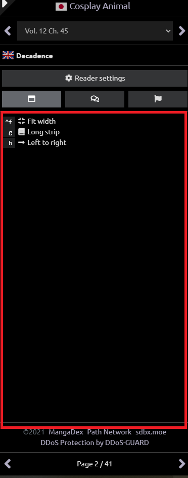
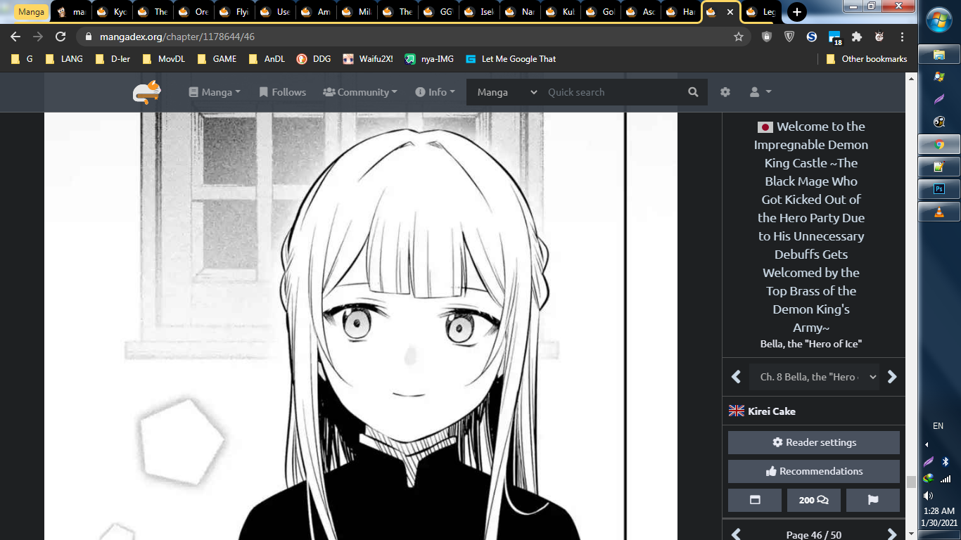
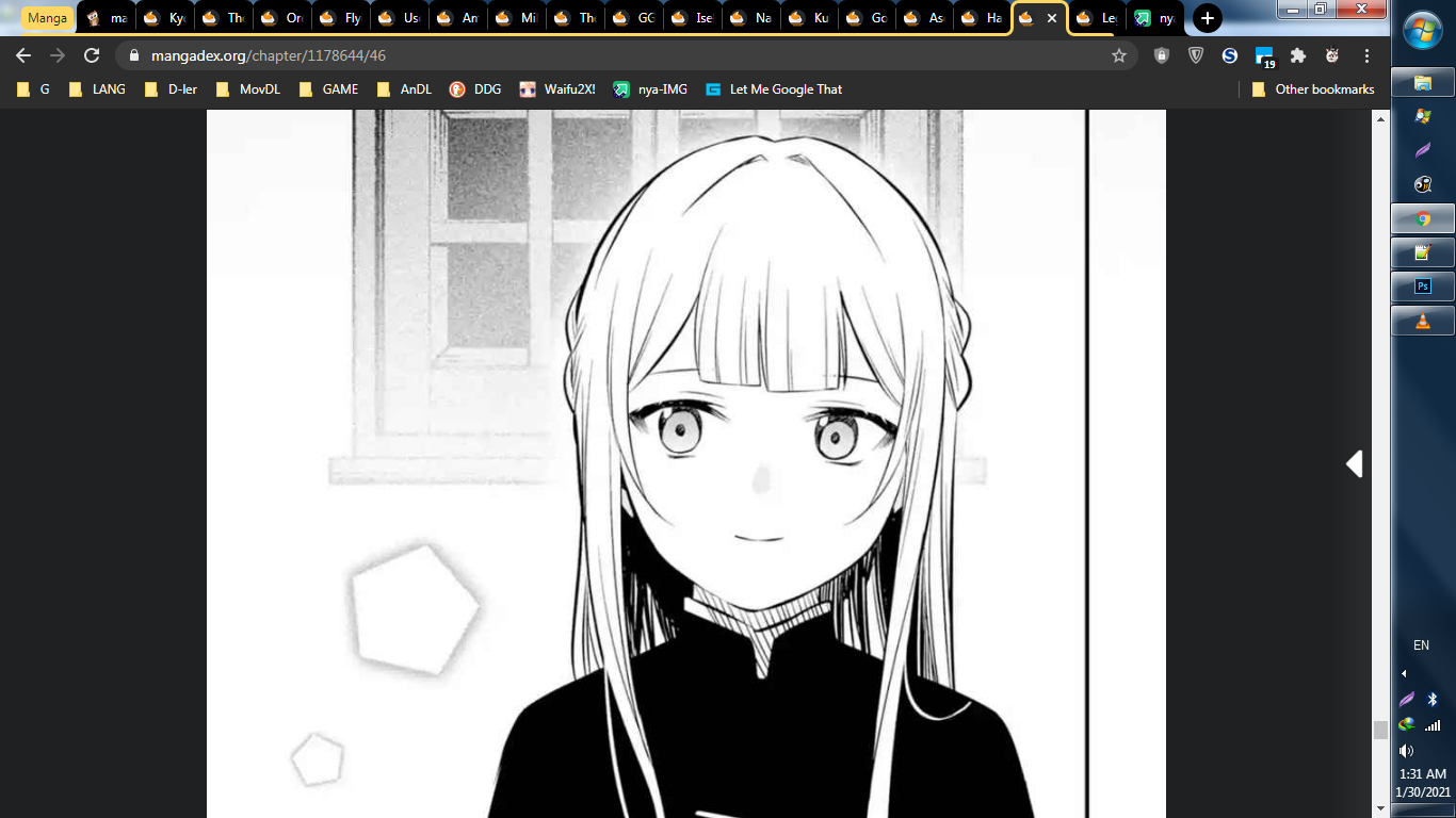
Now that I'm trying out the new reader (single page reading mode), I actually have a question about it.
Is there any way to add a couple pixels tall footer at the bottom of the page?
I got used to having that "© 2021 MangaDex | Path Network | sdbx.moe | DDoS Protection by DDoS-GUARD" footer taking some space at the bottom of the legacy reader so I'm kind of missing the ability to scroll down a little below the page I'm viewing. I'm not finding the option for this in the reader settings.
And having the option for some white space above the image would be nice too.
- Status
- Not open for further replies.
Similar threads
- Question
- 5
- Replies
- 6
- Views
- 81
- Replies
- 82
- Views
Users who are viewing this thread
Total: 2 (members: 0, guests: 2)


